As part of the annual design conference hosted by the American Institute of Graphic Arts, the Design Educators Community hosts a one-day symposium focusing on the current and future state of design education.
The Microsite
As the homepage for the Design Educators Community, this microsite gives details about the upcoming conference while offering a worthwhile experience that shows what the Lens Symposium offers.
As the online front to inform and attract people to the event, these are the microsite’s major design features.
Unification through Animation
Motion-driven interactions focus the user’s attention, aligning scattered elements into the unified narrative of the conference and building intrigue as users move through the page.
Hover to Inform
Hovering over elements reveals additional information and signals interactivity, helping users identify clickable areas.
Horizontal Scrolling
Horizontal scrolling adds another layer of interactivity, giving a clearer sense of timeline and progression.
Graphic Experimentation
To create the visual identity we drew from Dan Friedman, taking three qualities from his work that shaped our art direction:
- Isolated type
- Overlapping imagery and text
- Visual structure with alignment and neutral proportions
Using these qualities, we created the following assets to test the strength of the visual design.
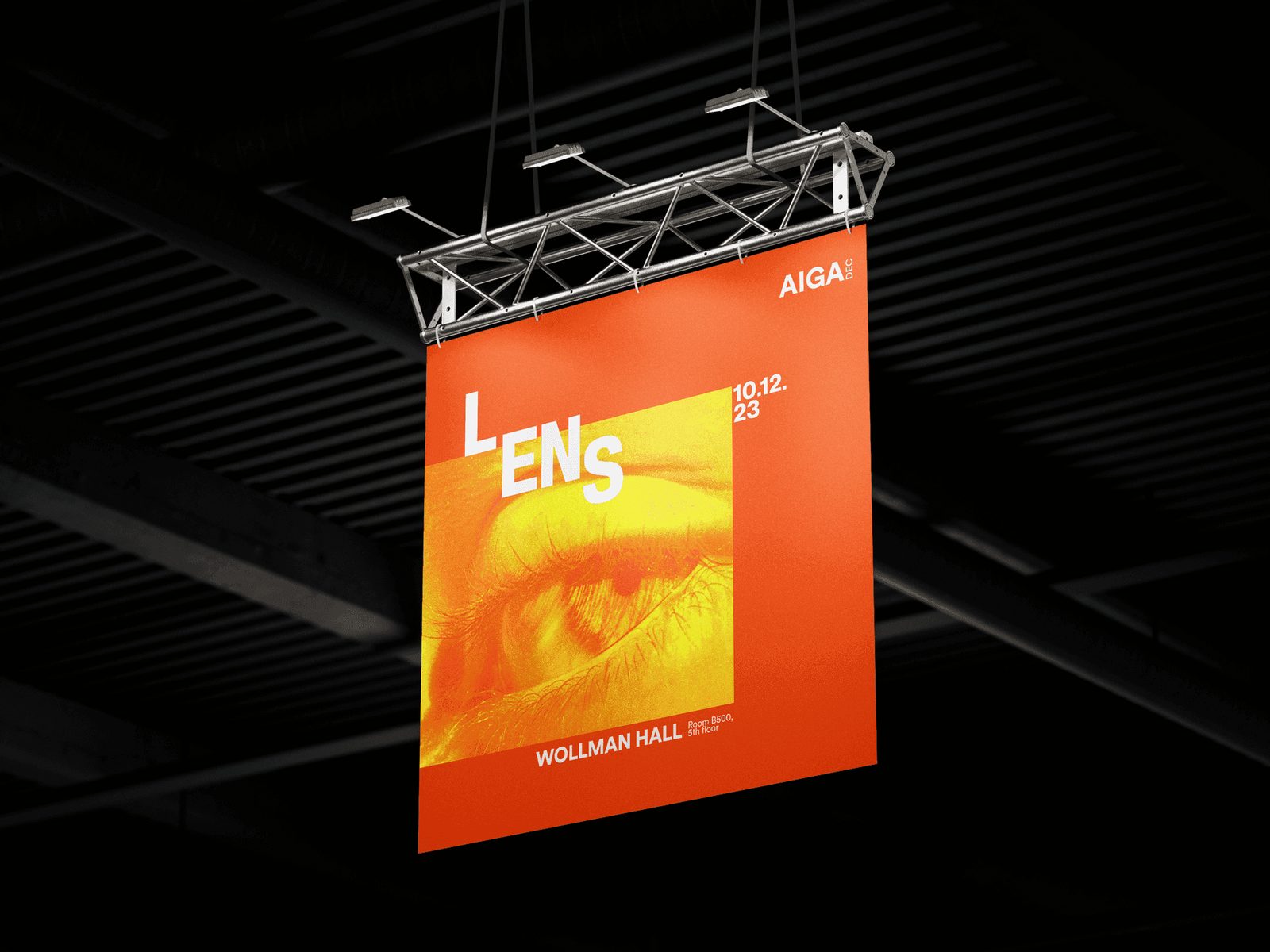
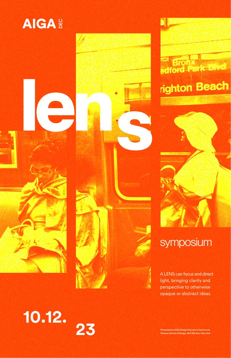
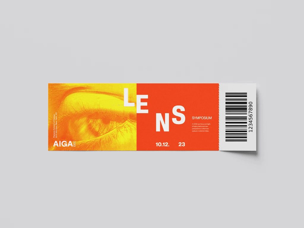
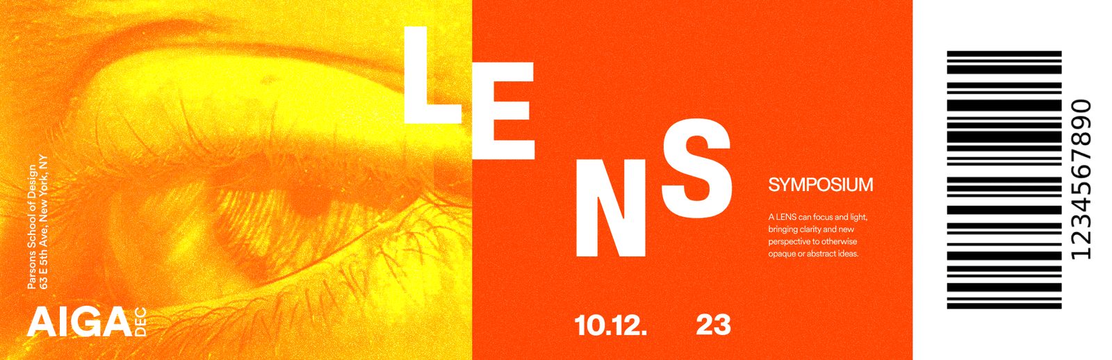
Banner, poster and ticket.
Key Learnings
- Don’t design in my head. You never really know how an idea will turn out until you see it and try it, so I get ideas into Figma early instead of planning them out mentally.
This is just a snapshot of the design process.
Reach out to jaylee2402@gmail.com for the full story.
Next

Museum of Vancouver
Short Film · 2025